Zoom in and Zoom out and you can learn a lot from every new project.
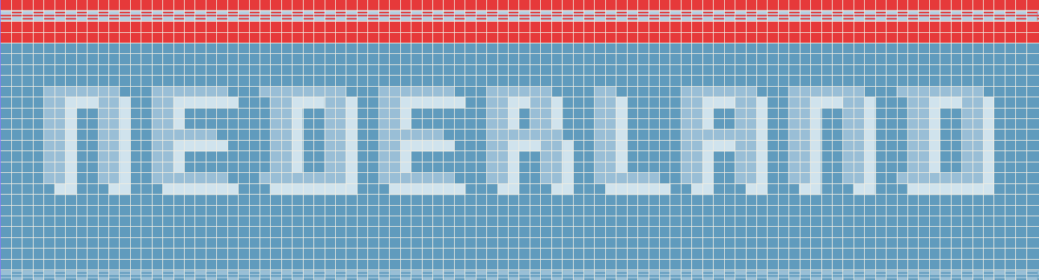
Poster design for Vouwblad Monospace Collection
The Vouwbald Monospace Collection is an initiative by Lenoirschuring, a printing office in Amsterdam, the Netherlands. It periodically gives designers the chance to express their passion for graphic design and the beauty that text, image, textiles and colours can create.
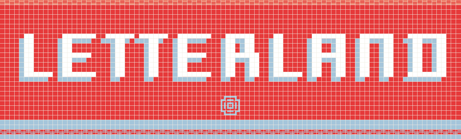
For the 10th edition of the Collection, designers sent in poster designs with integrated monospaced letters. The poster content was theirs to choose. This gave me the opportunity to pay tribute to the Netherlands and its wonderful type design tradition. The windmill and the tulip still are the cultural stereotypes that dominate foreigners’ images of the Netherlands. I can’t imagine the Netherlands without considering all the great type designers this small country has currently. Like the windmills that left a lasting mark on the Dutch landscape, the Dutch type designers are today leaving their marks, with their designs, on the visual landscape. The font I used for this project is a pixel-based font called Capibara Mono, designed by Pieter van Rosmalen.
BOLD MONDAY, PIETER VAN ROSMALEN >
Superficiality is the end of design. A designer needs time to acquire the necessary information; otherwise the design will only scratch the surface. One needs the details to grasp the essence of the task. I like to do research before I start a project. It gives the design the content necessary and the content the deserving design. Shall I zoom in for you?