Imagining something not yet in existence, is creativity.

The quirky Nitti Grotesk shapes
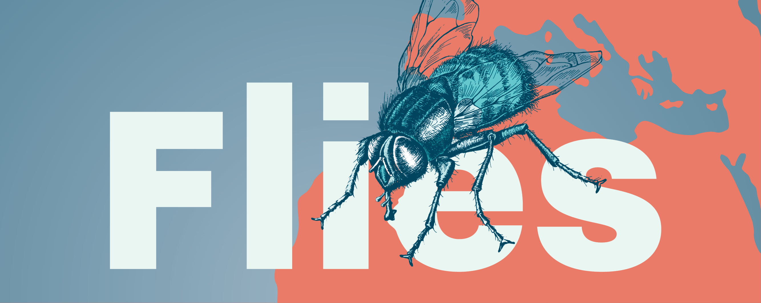
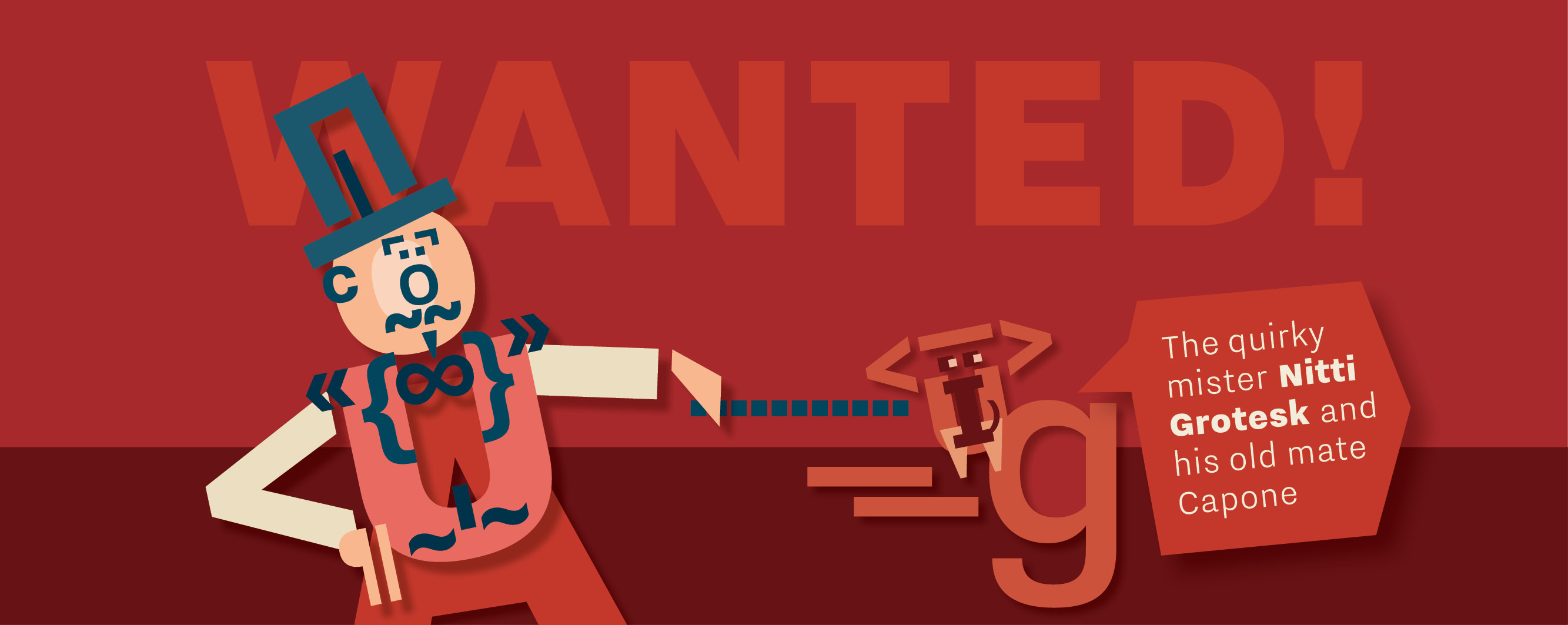
For the release of Bold Monday’s typeface “Nitti Grotesk,” designed by Pieter van Rosmalen, I received a request to produce a series of posters using the font with its quirky and typical early English sans-serif shapes.
With the industrial revolution, the late 19th century brought many economic and social changes. No wonder, type designers during this time deliberately tried to avoid typefaces with serifs. I took the beginning of the 20th century as a starting point in my research to find suitable poster topics. My creations vary in subject, appearance and the way I employ the typeface with its seven weights. The examples demonstrate how well the typeface serves many different applications.
Is Mister Nitti Grotesk not a respectable and likeable old chap?

Not every project gives a designer the opportunity to think outside the box. There are jobs requiring you to stick to the point. But, I appreciate it when I get the chance to think differently, which is why I experiment constantly, even outside of my contract work. Often such endeavors lead to very interesting client jobs. Take a close look and let me know, if you find something that triggers your fantasy!