Give colour to your work to emphasize your message clearly.
Haags Dierencentrum | The oldest animal shelter in The Hague
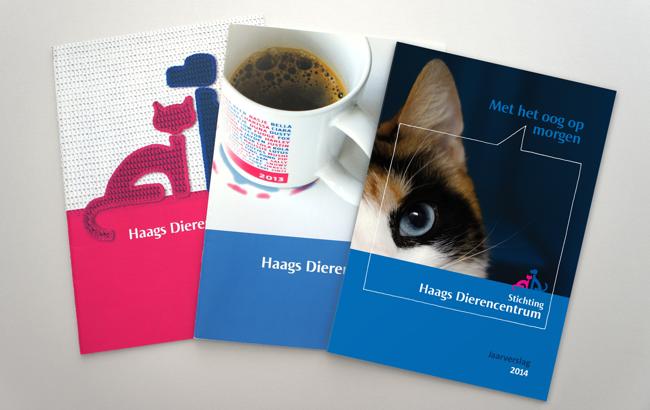
Since there wasn’t an officially designated corporate design, I used the existing logo and colours, and added 3 shades of blue to the various tables and information graphics in the report. The objective was to create consistency in their communications. I decided to work with the fonts another designer was already using for the quarterly magazine and was surprised how well the font Calibri worked in the tables. A photographer and staff members donated the pictures. My idea was to depict an animal’s life and experiences briefly, using speech bubbles next to the pictures. Unfortunately, we couldn’t realize the concept because management didn’t have access to information about the past of the individual animal.
As a designer, I require clear client objectives. I need to know in detail, which kind of people you want to reach for your product or service. We can examine together your target group and determine how you can best reach them, on- and offline. Give me a call!
